PRESS RELEASE: Mysteel Global kick starts the new year with a brand new logo
We are proud to announce the launch of the new international logo as part of our ongoing evolution of our company's brand.
Our international business has grown and evolved over the past 6 years, we felt it is time for a change. We have refreshed our logo to reflect who we are today and to symbolize our future.
After careful consideration, we chose a new logo that reflects a more modern look and captures Mysteel's vision to be the leading commodity data service provider globally.
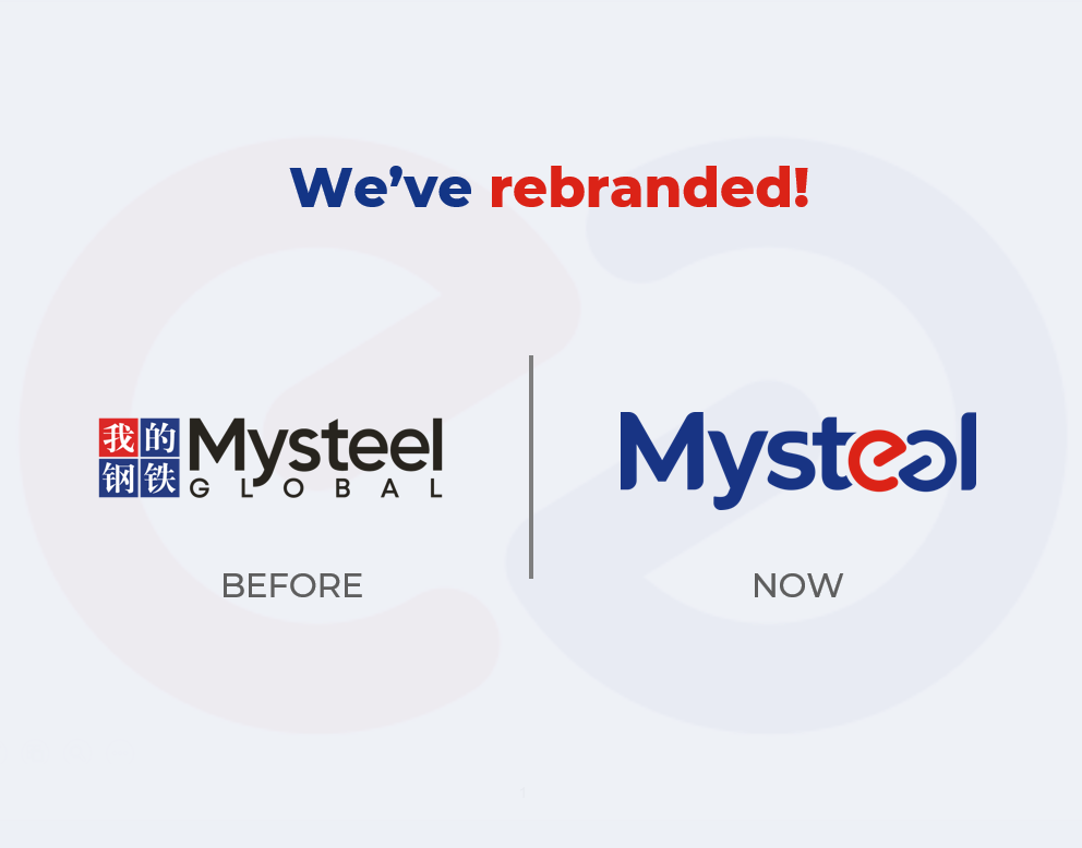
We keep the original two brand colours: "Blue" stands for integrity and trust and the "Red" retains a sense of energy and technology.
The red shaped "e" design stands for e-Business and digitalization, which indicates Mysteel's clear vision of leveraging the most advanced technology in data collection and product/service delivery.
The unlimited ![]() design indicates that Mysteel's ambition of covering ALL commodity categories (definitely beyond steel and non-ferrous) and provides our clients the best service with unlimited possibilities.
design indicates that Mysteel's ambition of covering ALL commodity categories (definitely beyond steel and non-ferrous) and provides our clients the best service with unlimited possibilities.
In the upcoming months, we will continue to update all our marketing literature and online presence etc. with the new logo. If you have any questions, please do not hesitate to contact us at Globalmarketing@mysteel.com.
We look forward to your continued support.